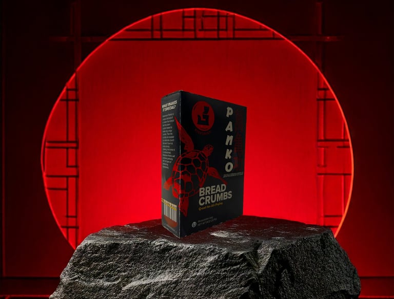
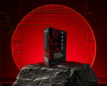
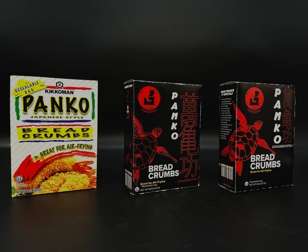
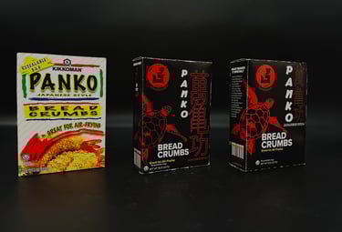
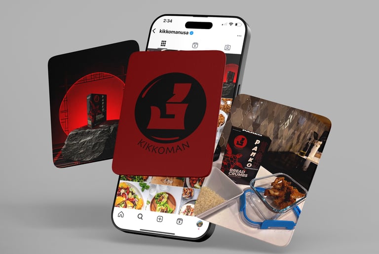
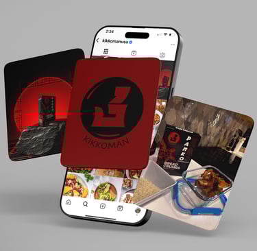
Kikkoman Re-Design
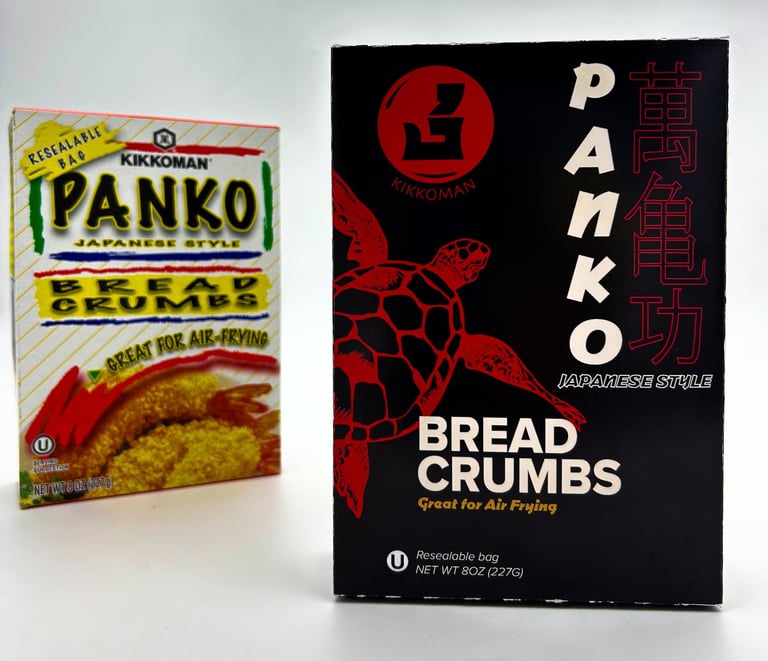
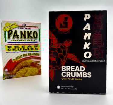
With Kikkoman Panko Breadcrumbs packaging being in desperate need of attention, a refresh was long awaited. From bright friction colours and no cohesive flow in hierarchy, finding a combination that would stand out on the shelf was important. With the striking black and new Kikkoman logo that ties in their traditional heritage, the new packaging came to life.
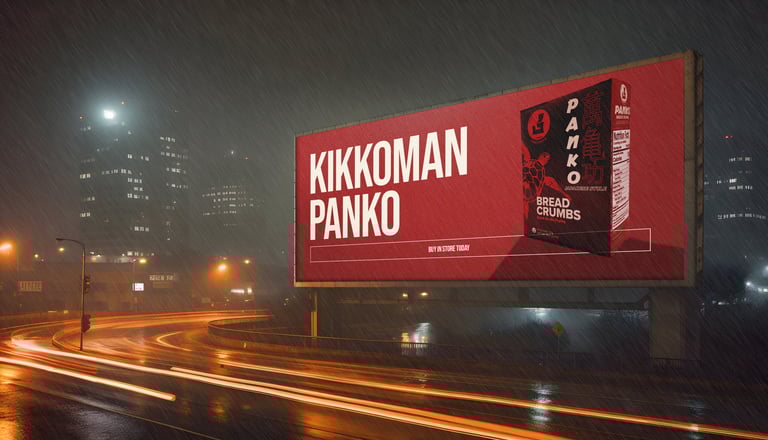
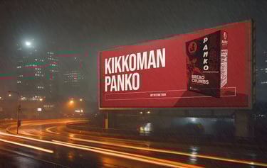
The new colour way mixed with the new modern logo and turtle illustrations which represent the strength and longevity of the Kikkoman brand.
#232323
RGB: 35, 35, 35
CMYK: 71, 65, 64, 72
#73020c
RGB: 115, 02, 12
CMYK: 31, 100, 100, 44
#bf0413
RGB: 191, 09, 19
CMYK: 17, 100, 100, 08
#c69143
RGB: 198, 145, 67
CMYK: 22, 43, 87, 03
#f2e6d8
RGB: 242, 230, 216
CMYK: 0, 5, 11, 5