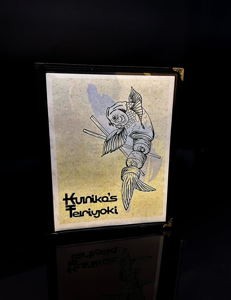
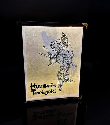
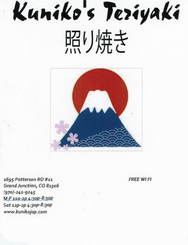
Kuniko's Menu Re-Design
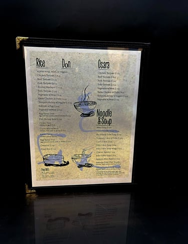
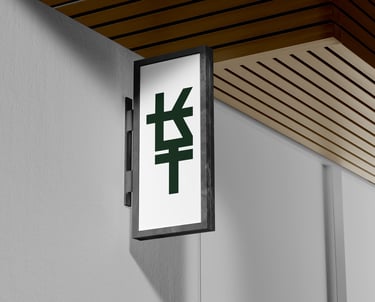
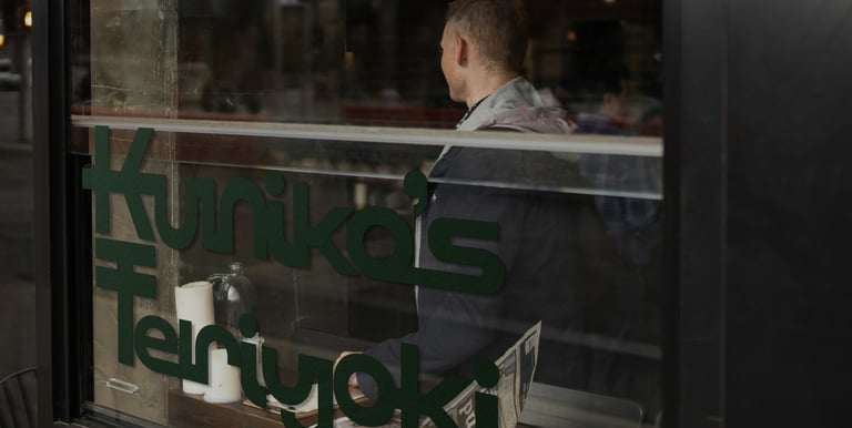
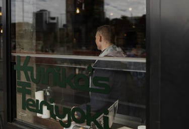
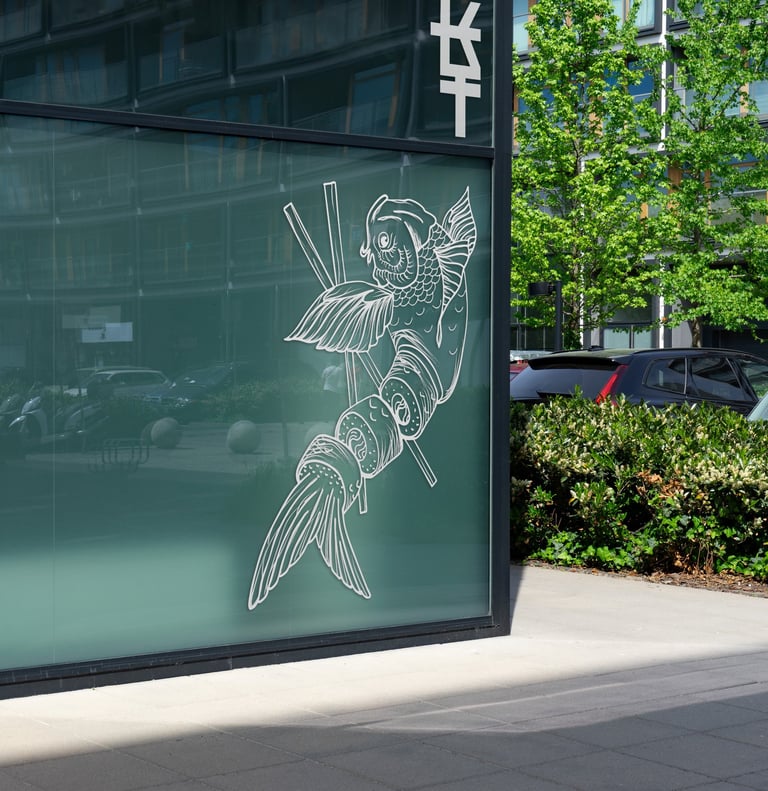
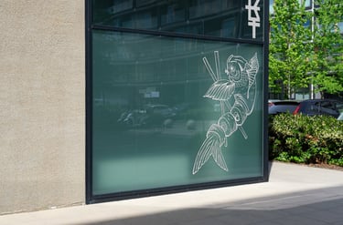
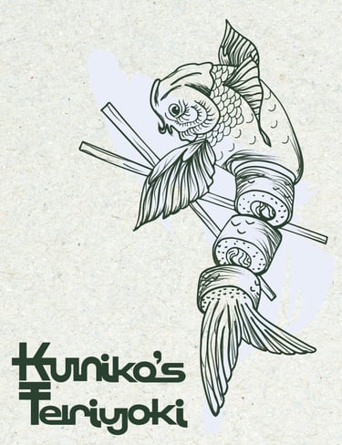
The Kuniko's Menu Re-Design began when the local Japanese restaurant had a menu that needed some attention. There was limited flow and significant friction from page to page. The brief was to condense the content into a four page spread, re-design the word-mark for Kuniko's and create a cohesive frictionless layout where the illustrations compliment the menu items.

Having a traditional Japanese feel throughout the re-design became a goal. With the new word-mark, the tone for the design had been set. Matching with modern appeal and simple colours that would allow for the illustrations and menu items to be the focus. Playful additions in the modified display type "Kensington" matched with the body "Freight Text" created a frictionless motion across all four pages of the spread.

#2a402f
RGB: 42, 64, 47
CMYK: 76, 50, 77, 47
#a2b7a6
RGB: 162, 183, 166
CMYK: 39, 18, 36, 00
#cfdaec
RGB: 207, 218, 236
CMYK: 17, 09, 01, 00


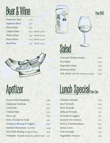

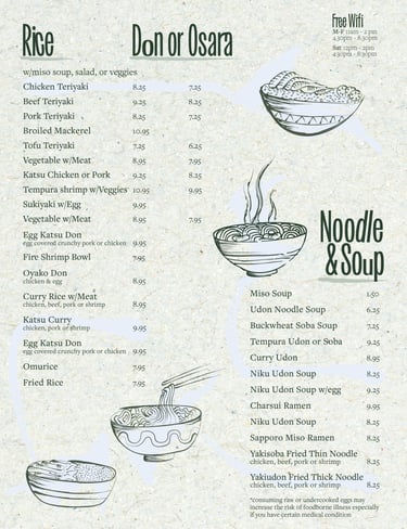
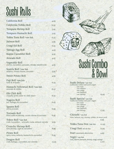

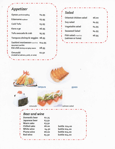


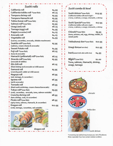
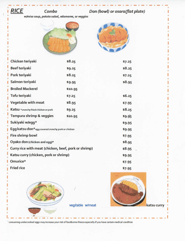


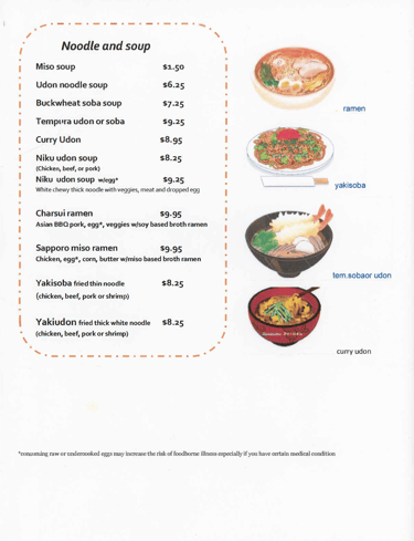

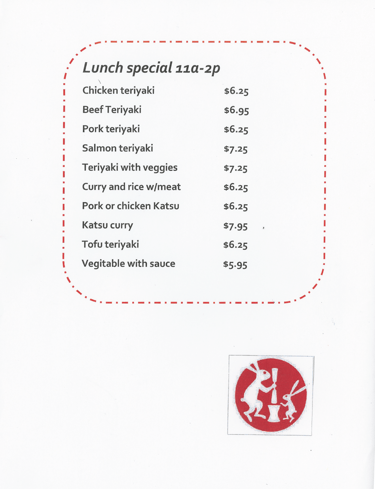
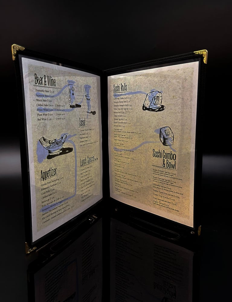
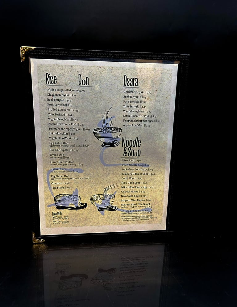
The original menu featured six pages where the re-design was taken down to four pages. The below spread embodies the new wordmark and style.